6/27/2008

Helvetica

Gary Hustwit's 2007 documentary about the midcentury sans-serif typeface Helvetica seems at first blush like it might turn out to be of parochial interest only. We expect documentaries to tackle weighty and substantial topics like labor disputes (Harlan County, USA), genocide (Night and Fog), corporate villainy (Roger & Me), and environmental degradation (An Inconvenient Truth), or at least expansive ones, like a day in the life of a city (Man With a Movie Camera), or emotionally moving ones, like the everyday struggles of an Inuit family in the arctic (Nanook of the North). The range of topics available to non-fiction filmmakers is virtually infinite, and yet to find an audience and a topic worth spending large sums of money and long stretches of time on, filmmakers need to seize on matters of clear public interest, whether because of their storytelling appeal or their importance to civic culture. The triumph of Hustwit's film is that, surprisingly, Helvetica rises to this level so effectively and convinces even the design-naïve viewer of the huge significance of typography--a significance that increases as ordinary people become more involved in the production of visual media.

Helvetica manages to accomplish this in several ways. The standard interview format of talking heads and cut-aways sells the message of a perfect, neutral, modern typeface, the culmination of a stylistic progression toward simpler and more universal forms which in the 1960s became the visual identity of numerous corporations. Among the corporate identities surveyed in the film, we see the names American Airlines, Crate & Barrel, National (rental cars), Toyota, Target, and Panasonic, all spelled in Helvetica. We see Helvetica in ads for Coca-Cola, on the billboards in Times Square, on office buildings and taxis and subway cars. It always looks at once official and unremarkable. One of the voices in the film compares Helvetica to air: it's everywhere you go, essential and easy to ignore.

The casting of designers and writers who appear in the film's interviews gives special focus to those who speak with extraordinary passion and articulacy. The profession of designer would appear to demand flawless presentation in all aspects of a person's outward appearance, and the talking heads in this movie, like Jonathan Hoefler and Tobias Frere-Jones, Michael Beirut, Rick Poynor, Stefan Sagmeister, and Massimo Vignelli, speak and look the role. The sense of their investment in surface appearance, in its significance for the ways meaning is communicated, helps sell the film's message. These bright, genial, careful design folk all seem quite convinced that type matters a ton, and one cannot help but find sympathy with well-spoken figures who look and sound so appealing. (That some of them despise Helvetica for being inexpressive or for being an excessively corporate style adds interest and demands even more careful consideration of the film's topic.)

But what makes the film especially effective is its presentation of type within ecological contexts, i.e., in the places one finds it in real life: on signage, on consumer products, on apparel, on posters, on vehicles, especially in the street, where many of Helvetica's best shots were taken.


The film's meaning is anchored by the words spoken in its interviews, but the argument is really made in the images seen in cut-away shots accompanying voice-over sound. The principal effect here is noticing: in particular, noticing details of the lived environment that had previously eluded notice. If one function of art is to train our perception of the world and make us more sensitive to its textures and forms, watching Helvetica is a kind therapy for living a more attentive life.

I often wonder why creative people who are interested in exploring non-fictional topics choose to make documentaries rather than to write articles or books. My prejudice as a verbal sort of person is for writing over moving images. One can make a better argument in writing; writing demands more ideas and words and tends to be more rigorous intellectually. If this were not so, perhaps academics would typically make documentaries instead of writing prose. I think I generally learn more from reading a good New Yorker article than I do from watching a documentary (for instance, check out this one from the current issue about itching), and the interview style that dominates documentaries today often subsumes the voice of the filmmakers under the voices of the subjects. Of course there are brilliant documentary artists like Errol Morris who do things only movies can do, and motion pictures tell us an infinite number of things that can never be described in words. I prefer documentaries that don't rely too much on their talking heads, that exploit the power of audiovisual representation.

Helvetica succeeds by using the techniques of visual media to its advantage. I could as easily learn about designer's attitudes toward Helvetica from reading a good article about the typeface. But the movie really does exploit the moving image; it uses visual forms to reveal the ubiquity of Helvetica, and to encourage the audience to appreciate this ubiquity. In the early minutes of the film, we see many dense images of public spaces in which our task as viewers is to find the important detail.


When we watch ordinary films and TV, we tend to know where in the frame to look: at eyes, at narratively significant details. There are habits of viewing that develop over a lifetime of spectatorship. In many segments of this film, rather than human forms or narrative details, the eye scans for letters and numbers, and when it finds them the mind must judge if they're Helvetica or not. In the shot of the American Apparel billboard, we need to realize that we're being asked to consider the font in which "American Apparel" is printed rather than the model's figure, her strange attire, or the bubble on her face. Each shot's duration functions like a ticking clock, encouraging us to get the right answer before time is up. This technique forces the viewer to become sensitive to details of the environment that were not previously a focus of attention. Indeed part of the film's point is that Helvetica blends in so well, it is such a default kind of typeface, made not to be noticed.

The film also gets tricky on us. We see images with more than one typeface and have to determine which is the type we are looking for.


Or we are invited to compare not only one font with another, but designed type with handwritten (or spray-painted) letters.


Then occasionally there is a shot without any Helvetica! And we mark its absence and its difference from other typefaces.


In some cut-aways we see images without Helvetica and wonder why we are looking at this shot at all, only to have the type revealed somehow. In one shot, customers entering a Crate & Barrel store obscure the signage in the door and only after some of them have passed do we see the type.


In my favorite shot in the film, we see an overhead view of a New York street shot from several stories above. Nothing in the frame seems to include any easily discernible type (there is the UPS truck but its text is barely legible). And then, a city bus enters the frame from the right, and as it does we see that the bus's number painted on the roof is in Helvetica.


This film not only asks us to notice the number painted on top of a city bus, a view we don't typically see, but also to appreciate the choice of Helvetica as the typeface. And the point of this is not merely to serve as a device along the way of making some other point; it is to appreciate the form of Helvetica. I smiled when I saw that.

It doesn't surprise me that the film was received well by designers. They're an easy sell for a documentary inviting the rest of the world to appreciate their often obscure craft. But Helvetica also has the potential to help the rest of us negotiate a new world in which everyday people, i.e., non-designers, increasingly make choices about design which were previously unavailable to us. Take this blog for example. When I set it up I chose a theme, fonts (including size and weight), colors, layout, widgets, etc. Yes, many people choose to leave the default setting intact, but this is also a choice. Making choices like these doesn't make us designers. Few non-professionals are inventing new fonts or anything remotely like that (there are tools for this if you want to give it a try, as this NYT article describes.). But DIY tools like blog templates (and myspace pages, which the film references, and so many other graphic components of web 2.0 apps) are still opportunities for creative expression; they function to fashion identity and project it outward into the world. Learning a bit about how designers think, where they pay attention and how they judge, what criteria they apply and when and why, can help us figure all this out.

***

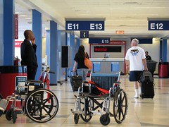
Since seeing Helvetica, I can't stop noticing type. The film has made me see the world differently, to notice things I hadn't cared about before, to put myself in the mind of the person who chose the font and wonder why they picked the one they did. I see Arial, a clone of Helvetica (which you are reading right now), and feel disappointed. I see Helvetica and get excited, even just by my ability to recognize it.

I took this photo in an airport the other day. There is more going on in it than the type, but when I look at it that's mainly what I see. I would like to think it could pass for a still from the movie.

ORD

6/25/2008

Advice Column

I am trying to work on a book and find myself drawn away from it by a number of things, especially the constantly changing, updating, world-improving, timesucking, doesn't-love-you-back internet. It's a challenge to avoid its call. Some strategies I have been trying...

1. Don't use a computer. This doesn't do it for me unless I'm reading a book.

2. Go work somewhere that doesn't have internet. I like the Alterra coffee shop on Prospect Ave., which charges for WiFi after 12:00 pm. I get a lot done there. Downside: it takes 10 minutes to drive each way, which wastes time and gas. Also, they sell really good, high-calorie baked goods. Yet another downside: sometimes I have my camera with me and I start taking pictures when I should be doing something else, e.g.,

Pink Umbrella

And another: there's an Urban Outfitters down the street and I always browse in there when I have the chance.

3. Use WriteRoom, the word processor that blacks out everything but your words (screenshot). This is good for writing a first draft but if you need to use footnotes or formatting or to work with your research online, it's a drag.

4. If you use gmail, enable the "take a break" option (from the gmail labs menu under settings). When you click "take a break," it deprives you of access to your email for 15 minutes. Along the same lines, if you're logged into gmail, choose "go invisible" in that chat window so that no one will start IM'ing with you just when you have begun to be productive.

5. Disable any email alert sounds. I did this years ago.

6. Remove Facebook from your bookmarks. This doesn't work for me because it's not that hard to type "facebook" into the address bar.

7. Don't blog. Sometimes I write something for this blog just to "get myself writing." Does Not Work.

6/10/2008

"That cat who lives in a garbage can should be out demonstrating and turning over every institution, even Sesame Street..."

Here are a few fragments of the historical reception of Sesame Street that I came across in some research I have been doing on the history of the concept of the "attention span" as it relates to moving-image media. (The research is for a talk I am giving this weekend at the conference of the Society for the Cognitive Studies of the Moving Image in Madison).

Brief background: Sesame Street was begun as an effort to bring pre-school education to disadvantaged children, especially black kids in the poorest neighborhoods of America's cities. The people at the Children's Television Workshop (CTW), lead by Joan Ganz Cooney, hoped that by reaching these kids through the television, students might arrive at first grade more ready to learn how to read and add and subtract and, more generally, to succeed in school and life. Kids were already watching a ton of television, so why not teach them where they already are? Thus the multi-ethnic cast and the urban setting, and the focus on teaching the most basic concepts like letters and numbers. By adopting the progressive agenda of late 1960s liberalism, the show aimed to create a more diverse and egalitarian society.

The character of Oscar the Grouch, who was orange before he was green, was supposed to teach young viewers that the world is "not made up of sweetness and light" according to the CTW, and that kids "had better start getting used to that." (Francke) He would afford an opportunity for children to encounter and experience negative emotions . As everyone knows, Oscar lives in a trash can by a front stoop and complains nonstop. Jim Henson apparently found the inspiration for Oscar in an extremely rude waiter. Carol Spinney, the puppeteer who also plays Big Bird, modeled his Oscar voice after a New York City cab driver.


When Sesame Street debuted in 1969 it was greeted by almost universal acclaim and great excitement about the possibility of finding a noble purpose in a medium which, at the time, was considered moronic and perhaps also dangerous. But within a couple of years it had begun to receive some negative, critical notices as well, by educators who objected to its teaching style and its adoption of formats of commercial television, including advertising ("brought to you by the letter Y and the number 2") and the "magazine style" of variety comedy shows like Laugh-In, with many brief segments mixing live action shot on location or in the studio, animation, and puppetry.

A New York magazine article in 1971 added another dimension to the show's criticism: the author, Linda Francke, interviewed a number of African-American viewers in NYC and found that many were hostile to what they perceived as the show's middle-class values. They found fault with the show for failing to represent the reality of life in poor neighborhoods. These lines of thought didn't surprise me very much when I read them yesterday because the same thoughts have occurred to me before. But the stuff about offense taken in particular to Oscar the Grouch was more novel; it had not occurred to me that anyone would ever find anything but delight in him.

Francke claimed that the African-American community was unified by its hostility to this character: "There wasn't a black I talked with who did not single out Oscar as one of the things they found so painfully wrong about Sesame Street." It continues:
Grace Richmond, director of education at the West 80th Street Day Care Center, got right into Oscar. "I react to the garbage-can character because that to me is the inner-city character. He's the one who's bottled up, and who compensates for it by saying he likes to live in a garbage can. That's really like saying it's all right to live in a dump. I don't agree with that. And the kids call it phony."

Dorothy Pitman Hughes, director of the West 80th Street Day Care Center, agreed. "That cat who lives in the garbage can," she said, "should be out demonstrating and turning over every institution, even Sesame Street, to get out of it."

A black minister, who didn't want his name used, said, "Sesame Street is telling a black kid that it's perfectly normal for you to live in a garbage can if you keep it clean. The Man is perpetrating the idea that that's where you're going to live and you out to be happy living there."
Francke clearly thought that these criticisms would sting the CTW folks, so eager to improve the lot of those who reacted so negatively to their work. The article continues:
I mentioned these reactions to Mrs. Cooney, and for a moment, she was speechless. Then she said, "It hurts me to hear that blacks think that. It tells me so much about the damage that 300 years have done that they think they're Oscar. We don't think they are Oscar. I don't understand that. Why would Oscar be them? Lord, I wouldn't dream of identifying with Oscar the Grouch. I'd be embarrassed as a human being. I mean...why...they're saying that they must feel that way. That they feel they're Oscar. Well, that's a whole different issue because that means anyone you could show, any grubby creature, anything, they'd say, 'That's me and I wish you'd take him off the air.'" That didn't seem to be the point, I said. It was the fact that Oscar wasn't trying to get out of his garbage can. "Well," she said with relief, smiling, "there's no evidence that the little black kids identify with Oscar any more than they identify with anybody else. Ernie has emerged much more as the character they identify with. That tells you a lot about the health of kids rather than the mental ill health of adults!"
One thing especially worth noting here is that Francke quotes adults rather than children, but that Cooney gives herself the authority to speak for the children in her audience. This underscores the extent to which adults mediate children's culture for them, framing media texts and giving them context, choosing what children will experience and how they will experience it. At the same time, adults who presume to speak for children's reception are liable to impose their interests on kids, to see what they want to see rather than what children actually see.

Oscar was not the only muppet singled out for criticism over the years; a bright but trouble-making, "jive-talking" African-American character, Roosevelt Franklin, was eventually dropped from the show because of concerns that he was a negative racial stereotype and a bad example for children.


A certain affinity between Oscar and African-Americans seems to have persisted over the years, despite my inability to find much in the way of formal criticism since the New York article in 1971. The most recent instances I have seen occur in online remix culture, where the muppets, as a touchstone of several generations' youth, frequently appear. For instance, I have previously here linked to this video mashing up the muppets and Pulp Fiction. More recently on Fraktastic I posted this video mashing up the muppets and Woody Allen's Manhattan. The supreme oddity of Bert is Evil is well known to memesters and students of convergence culture.

A number of remix videos have taken audio from a David Chapelle standup bit about Sesame Street and a segment on Chapelle's Show ("Kneehigh Park", a parody of SS) and combined them with video from Sesame Street. Chapelle's Oscar riff from his 2000 TV special Killing Them Softly makes clear that he sees him as more urban than other muppet characters (transcript as follows from Wikiquote):
Have you ever watched like a cartoon that you used to watch when you were little, as an adult? I was sittin there with my nephew. I turned it on Sesame Street. And I was like Oh good. Sesame Street. Now he'll learn how to count and spell. But now I'm watching it as an adult and I realize that Sesame Street teaches kids other things. It teaches kids how to judge people and label people, thats right. They got this one character named Oscar. They treat this guy like shit the entire show. They judge him right to his face. 'Oscar you are so mean. Isn't he kids?' 'Yeah Oscar, you're a grouch!' He's like 'Bitch I live in a fucking trash can! I'm the poorest mother fucker on Sesame Street. Nobody's helpin me.' Now you wonder why your kids grow up and step over homeless people, like 'Get it together, grouch. Get a job, grouch'
The line "Bitch I live in a fucking trash can!" is one especially ripe for remixing. One video I have seen (YouTube has taken it down) strings together a bunch of innocuous Sesame Street scenes of Oscar talking to human beings, inserting "Bitch..." for Oscar's dialogue.

In this very foul clip, a segment from "Kneehigh Park," the whole joke is that Oscar is from the 'hood.

Ghetto Oscar

This gets remixed/mashed up in this vid of Oscar cussing out the Teletubbies, with the Grouch portrayed through the audio-track as black and the Teletubbies as white, despite the fact that neither Oscar nor the Tubbies have conventional markers of ethnic or racial identity.


Indeed, one of the things I have always found especially endearing and distinctive about the Muppets is the way they confound or confuse identity categories like child and adult, white and non-white, human and non-human, etc. (For instance, who exactly are Ernie and Bert?) I remember being a bit surprised to learn that the puppeteer who performs Elmo, Kevin Clash, is black--surprised more than anything by my own reaction, catching myself in the assumption that an adorable red furry monster would have or lack any particular ethnic or racial markers.


This point of this discussion obviously is not to point out that Oscar (or Elmo) is coded black (or not), that he is a racist representation, or that there is something offensive about how the CTW characterized him. I don't buy any of these ideas, though I respect the fact that others might. What I think is worth taking away from these bits of reception and interpretation and appropriation of one piece of the enormous Sesame Street text is the distance between the way the show has always represented a progressive ideal of community (Jennifer Mandel calls it "beloved community") and the way that the minority community that the show's creators aimed to reach found its own meanings in it, a product of their own contexts of experience.

References:

Linda Francke, "The Games People Play on Sesame Street" New York (April 5, 1971
).

Jennifer Mandel, "The Production of a Beloved Community: Sesame Street's Answers to America's Inequalities" The Journal of American Culture 29.1 (2006), 3-11.